How I Built This Portfolio: structure, theme, and sanity
tl;dr… Jekyll + a light formal theme, dark project cards for contrast, and simple data-driven JS for a filterable projects grid.
Why a portfolio site (and not just LinkedIn)
- I needed a formal, fast place that shows work and thought process.
- Ownership: no plugin sprawl, no surprise updates.
Two sites: formal vs. personal
- This site: formal, minimal, case-study friendly.
- Personal site: experiments, notes-to-self, and more opinionated posts.
Choosing the colour scheme
- Base: white + greys for a professional tone.
- Primary: purple (#6b4ad8) with icy blue accents for state/hover.
- Contrast: near-black project cards to make work samples pop.
Pages & structure
- Home → snapshot, competencies, selected work, latest posts.
- Projects → tag filtering powered by a tiny JS file.
- Certifications → FCC first; degree details collapsible.
- Blog → featured on top, paginated list, categories/tags hubs.
Stack & decisions
- Jekyll: Markdown + Git, zero DB, deploy anywhere.
- Styling:
_sass/_theme.scsswith brand tokens (purple/ice). - JS:
/assets/js/main.jspopulates cards + filter (with?tag=…). - Accessibility: focus rings, readable muted text on white, keyboard filter controls.
What I’ll use the blog for
- Short write-ups on support ops and documentation patterns.
- Tiny front-end utilities and automation snippets.
- Transparent notes on what I change here over time.
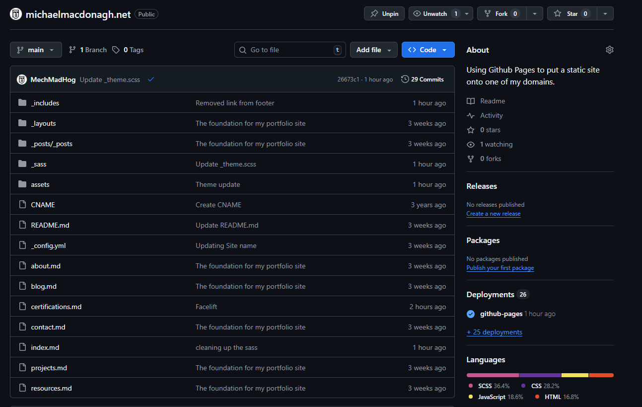
Grab the source
Want to recycle the scaffolding? The entire site (theme, blog, filters, and build) is open here:
👉 Repo: michaelmacdonagh.net on GitHub
Clone it, customize the theme tokens, and you’ve got a fast, formal portfolio in minutes. If you’re the “save it for later” type, star it up and stash it for now.