How I Built This Portfolio: structure, theme, and sanity
tl;dr… Jekyll, a light formal theme, dark project cards for contrast, and a small amount of data-driven JavaScript for a filterable grid.
Why a portfolio site (and not just LinkedIn)
LinkedIn is fine for visibility.
It is not good for control.
I needed:
- a fast, structured place to present work properly
- somewhere I could show process, not just outcomes
- full ownership of layout, content, and behaviour
Why I moved off WordPress
I didn’t like Gutenberg.
It wasn’t easier.
It just felt convoluted and overcomplicated.
On top of that:
- WordPress sites get bloated quickly
- Plugins introduce unpredictability
- Performance suffers
- Hosting costs add up
It turns into something you maintain, not something you use. I didn’t want that.
Two sites: formal vs. personal
Splitting the sites solved a problem:
One site trying to do everything ends up doing nothing well.
This site (formal)
- clean
- minimal
- structured
- designed for portfolio use
Personal site
- experimental
- opinionated
- more visual and expressive
This lets me:
- keep one side professional and readable
- push the other fully into style (cyberpunk, CRT, etc.)
No compromise between the two.
Git as the backbone
Both sites are managed through Git.
At that point:
I may as well just work directly in the site itself.
- write in Markdown
- commit changes
- push updates
No separate CMS layer.
The sites become:
a designed extension of my GitHub
Colour system
The goal was simple:
Professional first, identity second.
- Base → white and greys
- Primary → purple (#6b4ad8)
- Accent → icy blue
Contrast decision
Projects sit on near-black cards.
This:
- separates them from the page
- gives them visual weight
- keeps the rest of the site clean
Pages & structure
Everything is built to answer:
“Can this person do the job?”
Home
- overview
- competencies
- selected work
- recent posts
Projects
- filterable grid
- tag-based
- simple JS
Certifications
- FreeCodeCamp first
- degree details collapsible
Blog
- featured posts
- pagination
- category + tag structure
Stack & decisions
Jekyll
- Markdown + Git
- no database
- deploy anywhere
Simple and predictable.
Styling
_sass/_theme.scss- centralised colour tokens
Consistent across the site.
JavaScript
/assets/js/main.js- renders project cards
- handles filtering (
?tag=…)
No frameworks.
Just enough to do the job.
Accessibility
- visible focus states
- readable contrast
- keyboard navigation
Built in from the start.
Trade-offs
This approach means:
- no CMS convenience
- no drag-and-drop editing
- everything is manual
You are responsible for:
- debugging
- fixing issues
- making sure it actually works
There is more trial and error.
But the upside is:
- full control
- no hidden complexity
- no external dependencies
What improved
After switching:
- the site is faster
- the structure is clearer
- updates are simpler
- costs are lower
More importantly:
I spend time building instead of maintaining.
What this blog covers
- support operations and documentation patterns
- small front-end utilities
- automation
- changes to this site over time
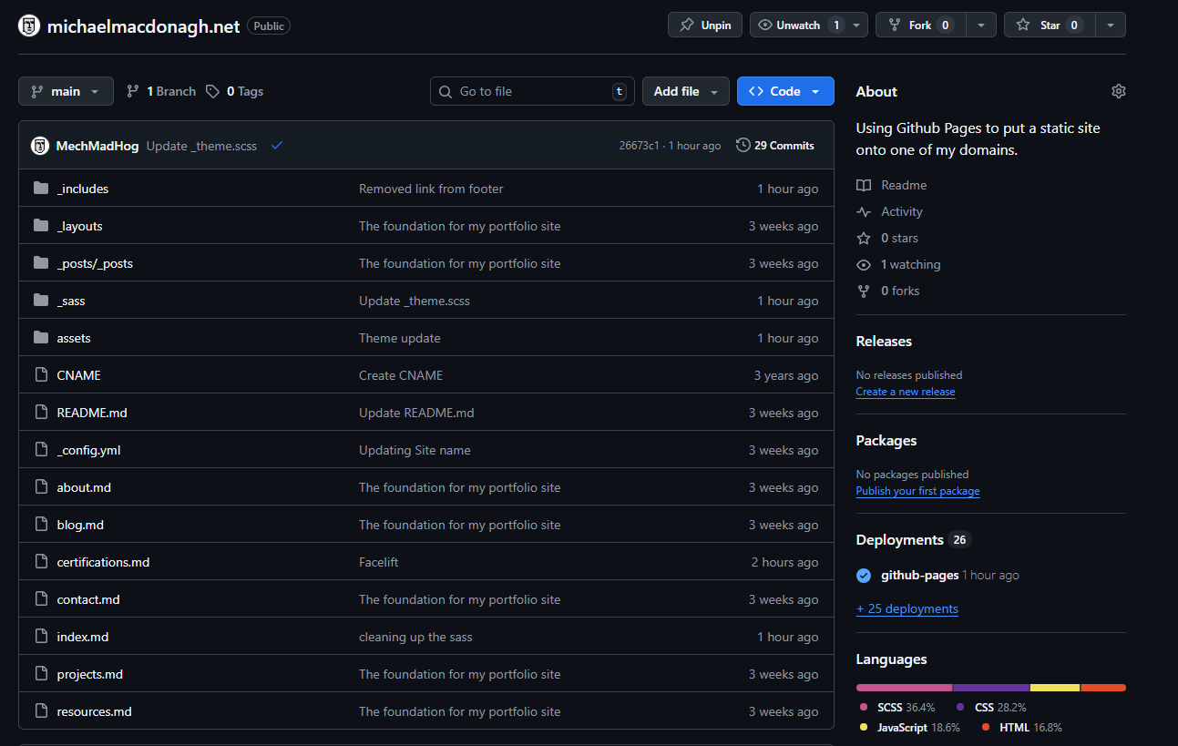
Source
The full site (theme, blog, filters, and build) is available here:
👉 Repo: michaelmacdonagh.net on GitHub
Clone it, adjust the theme tokens, and you have a fast, minimal portfolio ready to go.